What is it Used For?
This component is used for indicating a specific status such as ON/OFF. If you use this component, then the input value is switched according to a defined order whenever the component is clicked.
Component Properties
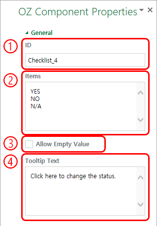
① ID
Enters the ID of the toggle component (e.g. ‘checklist_4’).
② Items
Enters the list of items that will be toggled whenever the toggle component is clicked. You can separate each item by pressing the ‘Enter’ key.
③ Allow Empty Value
Checking this option allows you to clears the item displayed on the toggle component. When you select a toggle component, you can toggle to another item but cannot clear the item displayed on the component. However, by checking this option, you can clear the item displayed on the component as described below.
- PC: Right-click on the component to display the pop-up menu and then select the ‘Initialize Input Data’ menu.
- Mobile: Click the trash can icon.
④ Tooltip Text
Displays the description in the tooltip text when you hover the mouse over an input field.