What is it Used For?
The radio component is used for checking which radio button is selected among multiple radio buttons. When data is downloaded in CSV format, the selected radio button will be displayed.
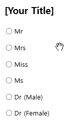
In the example above, if ‘Mrs’ is selected, then data is stored as ‘Mrs’.
* What’s the difference between the ‘checkbox’ and the ‘radio button’?
The checkbox is used for checking the status of an item (whether it is checked or not), and the radio button is used for checking which among the multiple items is selected.
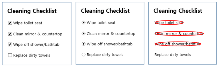
[Using Components: Check]
[Tip] Entering data inside the component
In Word and PowerPoint, the radio component is shown as a rectangular shape. Make sure to enter data inside the rectangular shape. This is because if you place a component over the information already entered, then the two will overlap with each other.
Component Properties
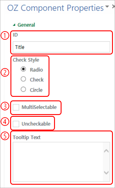
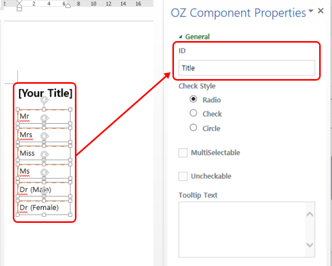
① ID
In Component Properties, make sure that all the selected radio buttons are assigned the same ID. For example, if there are six radio buttons (Mr, Mrs, Miss, Ms, Dr (Male), Dr (Female), then they must all have the same ID.
② Style
You can choose the style of the radio button component in Component Properties. The default style is the red circle, and you can change it to another style (checkbox and radio button).
③ Multi-selectable
Checking the ‘Multi-selectable’ option allows you to select multiple items. If you select more than one item, then when data is saved, each item is separated with a comma (,).
④ Uncheckable
Checking the ‘Uncheckable’ option allows you to deselect a selected item by clicking it again.
⑤ Tooltip Text
Displays the description in the tooltip text when you hover the mouse over an input field.