What is it used for?
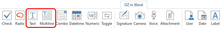
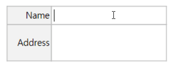
Both the text component and the multiline component are used for creating a text input field. The text component is suitable for short text with 1 to 2 words, and the multiline component is suitable for long text with more than 1 line.
Component Properties
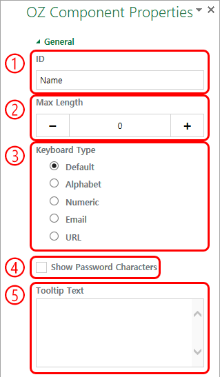
① ID
Enters the ID of the text/multiline component (e.g. the ID of the component in which John Doe, Jane Doe, etc. are entered can be named ‘personName’).
② Max Length
Sets the maximum length of characters (including space) that can be entered. By default is set to ‘0’, and there is no character limit if it is set to ‘0’.
③ Keyboard Type
Selects the keyboard type to be used when entering text in the component. ‘Keyboard Type’ can only be used in mobile devices such as smartphones and tablets.
④ Show Password Characters
This option can be set only in the text component. By checking this option, the password is hidden with the password symbol (●) when entering text. The password is also hidden with the password symbol in PDFs, and can only be seen when downloaded in CSV format.
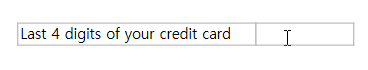
④ Tooltip Text
Displays the description in the tooltip text when you hover the mouse over an input field.